Re-designing mobile Cover letter builder
Improving navigation & interaction design
Summary
👉Background: MyPerfect’s cover letter creation tool helps millions of job seekers quickly create a cover letter for a job by answering a few questions about their career situation and desired job. Job seekers come from an array of background like entry level, mid -level and senior across various industries.
⁉Problem: MyPerfect’s cover letter creation tool on mobile had an outdated mobile experience. Users reported it hard to navigate and use the cover letter builder tool on mobile. We also found that the conversion rate was much lower for mobile users.
💡Solution: Re-designed the mobile experience with improved navigation, interactions and letter editor experiences.
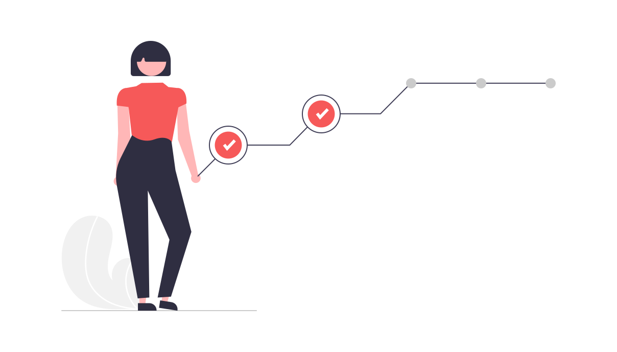
📈Impact: Increased registration by 12% and conversion rate by 7% as well as bringing in $350k+ increased revenue in the first year.
My Role
UX/UI designer I was responsible for:
- Defining the project including identifying usability issues, prioritizing and scoping them with the product manager.
- Defining solutions through design research, designing prototypes and evaluation.
- Designing the final designs for dev handoff as per the technical and product constraints.
Process
Discovery Research
Analyzed existing research about user feedback on the mobile experience. Conducted heuristic evaluation of the end to end mobile experience along with the product manager.
Key Evaluation Heuristics
- Visibility of system status
- User control and freedom
- Error prevention
- Flexibility and efficiency of use
Define Problem
Defined the user problems and the design problems across the end to end cover letter creation experience.
Key Problem Areas
- Product navigation not consistent and complex for smaller mobile viewports
- Key content and actions lacks hierarchy and often requires scrolling
- No feedback to user in the stepwise builder process
- General & vague UX copy and messaging
Design exploration
Giving Feedback to user
On average user spend 3 days and more than 2 web session to complete the cover letter creation process. And one of major
products issues was lack of progress feedback to the user.
Users failed to understand where
they were in the multistep cover letter creation process.
I explored 3 design concepts to show user's progress and remaining steps in order to guide and motivate them.
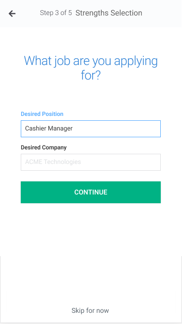
Explicit textual progress shown however higher cognitive load from reading
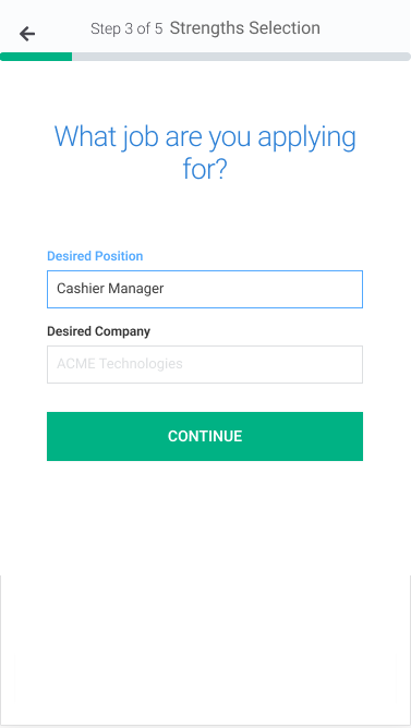
Simple and shows progress visually however next steps not known
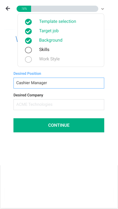
Shows progress visually with detailed steps information available on progressive disclosure however complex and details not as relevant to user's task completion
Improving interactions for mobile user
Many interactions were clunky and not designed for mobile making it tough for the user to stay focused on the task.
Finding the primary button, irregular font sizes and excessive scrolling were major global issues across the cover letter builder.
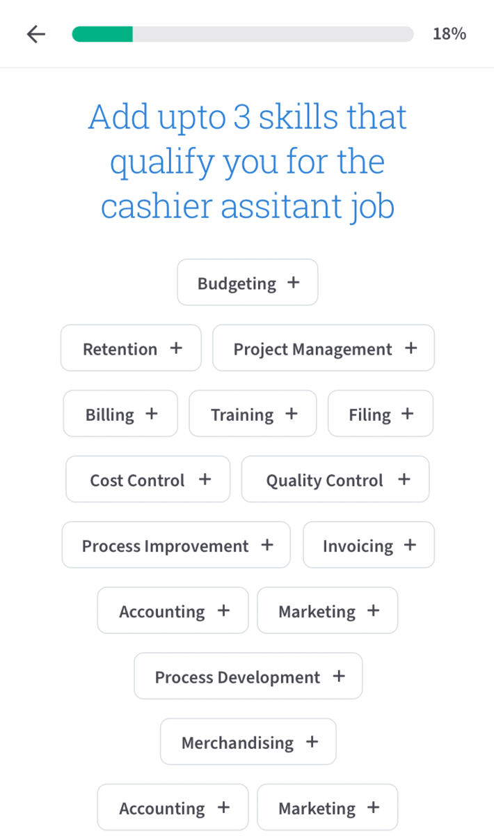
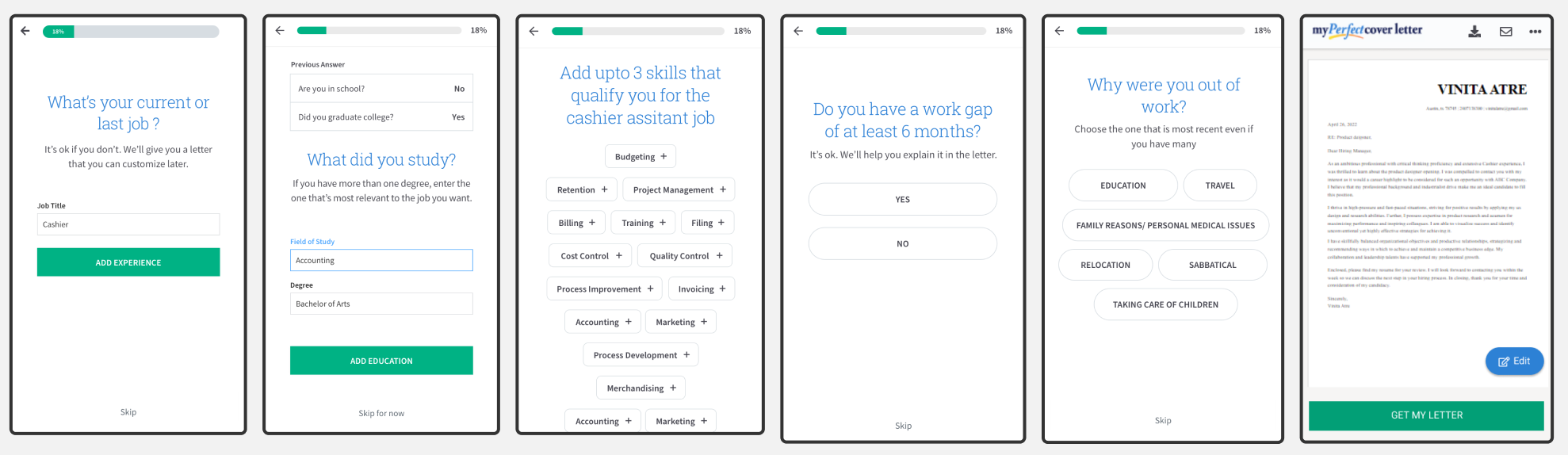
Showing selected design changes for skills
and login/registration experiences.
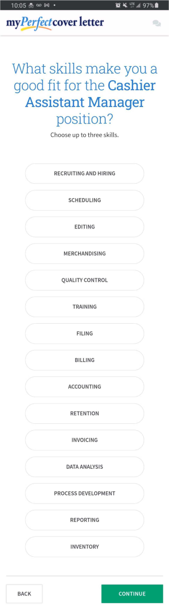
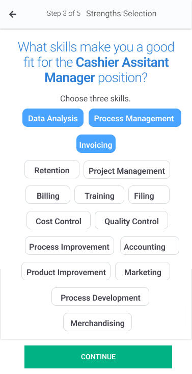
Sticky primary CTA to add skills appears as user selects skills.
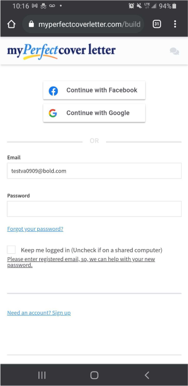
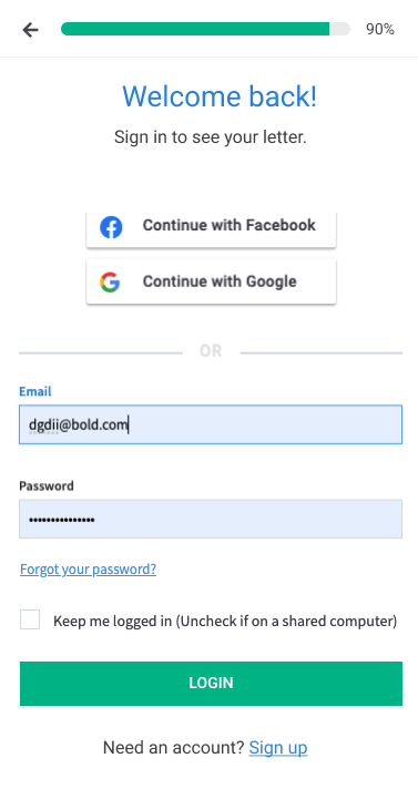
Concise and clear page & buttons copy as well as updated interactions for sign up, forgot password and registration
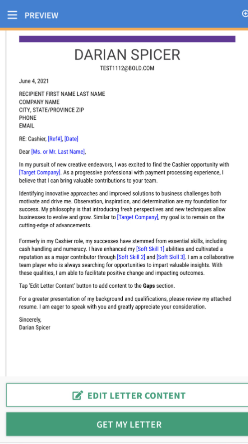
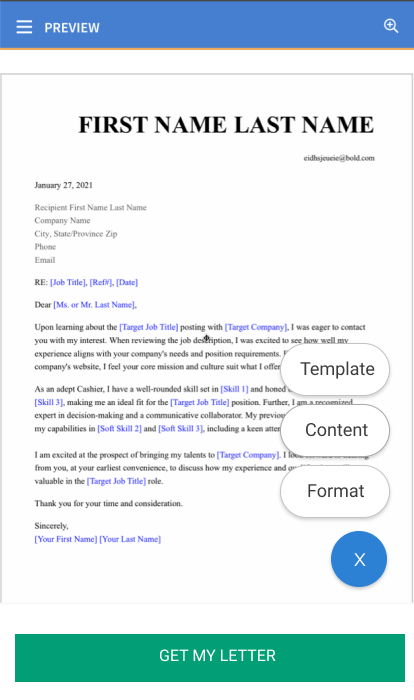
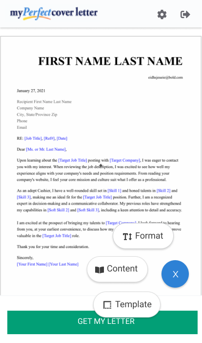
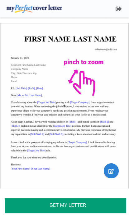
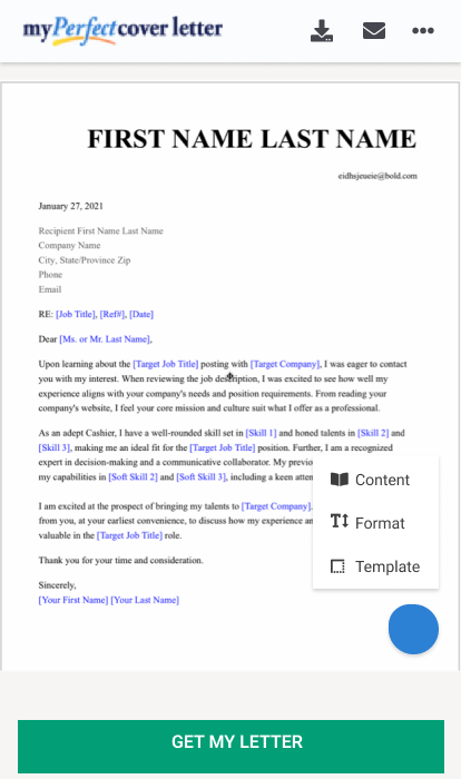
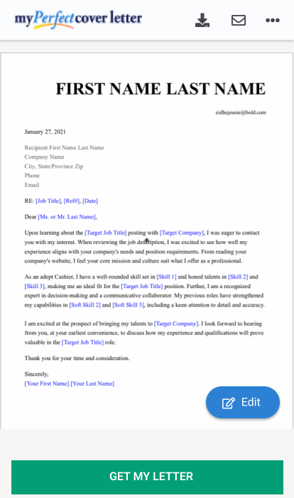
Cover letter editor experience on mobile
The feature rich letter editor page was found to be cluttered. One of the biggest issue for a first time user which comprised of the majority of
our product users was feature discovery and intutiveness. We found that one of the main reasons was the hierarchy of actions and content on this page.
Existing experience shows multiple areas to initiate an action through different buttons within the hamburger menu, page header, sticky footer.
Explored concepts for simplifying navigation available to user, regrouping similar actions, introducing gestures and re-designing header.
Prototyping
Designed interactive prototypes for different problem areas to evaluate the problem-solution fit. The letter editor experience prototype was used to evaluate the new content and function hierarchy. The stepwise builder experience prototype was used to evaluate the new builder navigation and interactions.
Key Activities
- Interaction Design
- Wireframing
- Interactive prototyping
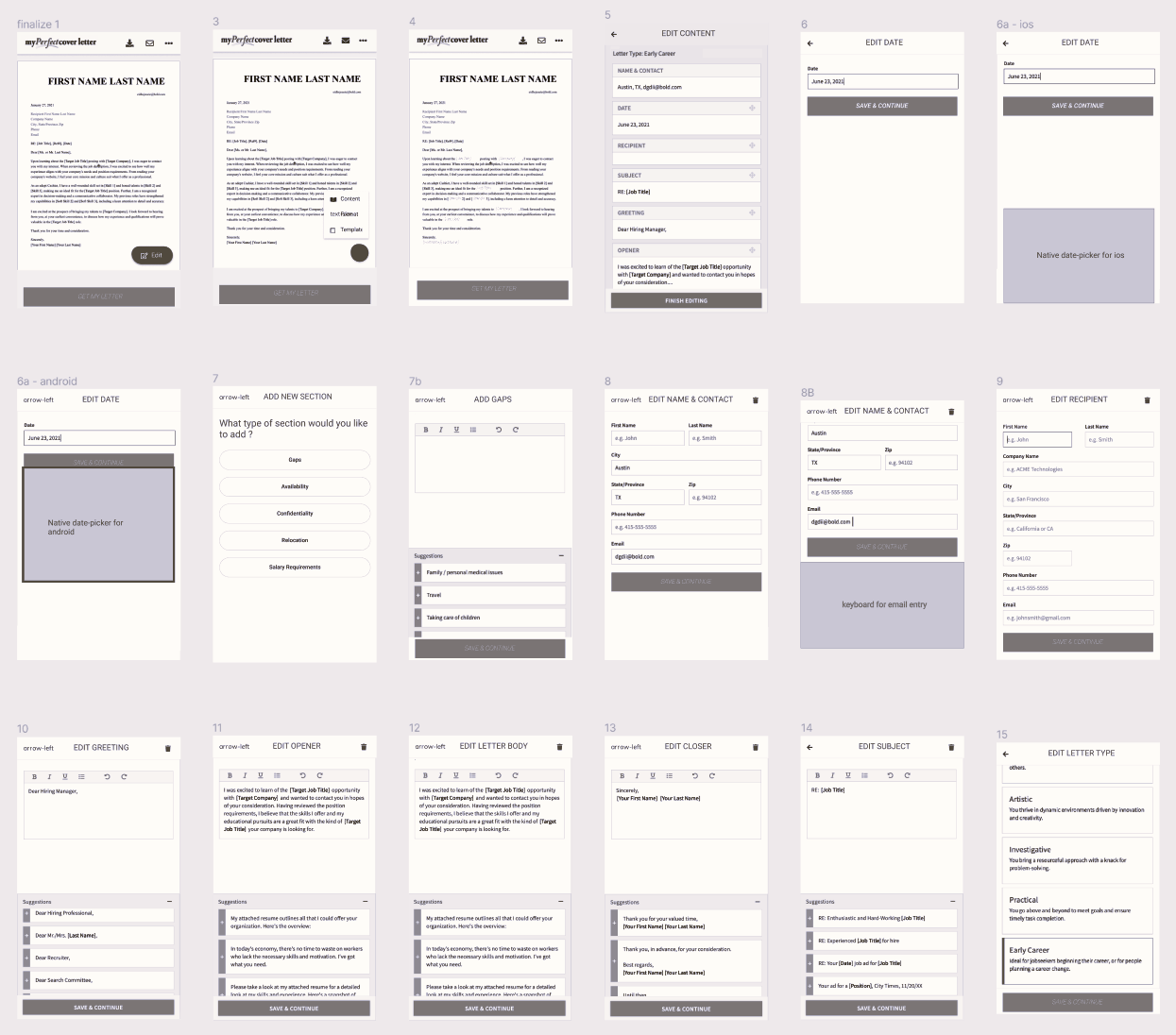

Evaluation
Conducted stakelholder design reviews to uncover contraints, make design tradeoffs and iterate designs.
We found the generic continue CTA to be less clear in stepwise builder process. Based on the feedback, we updated the copy for CTAs, for eg, Skills page CTA was updated to "Add skills (1, 2, or 3)", previous experience page CTA was updated to " Add experience".
Key Activities
- Design reviews
- Cognitive walkthrough
Mockup Designs
Advocating for the user, I help scope the design work for sprint with the Product manager. Worked with the engineers during development by communicating and discussing the UX and UI designs, decisions and design trade-offs.
Key Activities
- Design Specs
- Design tradeoffs