Dropout Dashboard
CloseCreated a Dashboard design from the perspective of two different personas to help understand the increasing dropout problem at the college
Discover Phase
Scenario: It has been observed that College X has an increasing dropout rate that maybe due to a few known factors like low GPA, high cost of university, low family income, high/low dorm age, high/low freshman age and some other unknown factors.
Understanding the Business needs
The dashboard app needs to help the vice-president of administration to understand the dropout situation by data comparison and tackle it.
Understanding the user
Since this was a more generic problem, I did behavioral research on people in educational institutions as well as various factors for educational dropouts I made two user persona for the solution who will approach the problem in two different ways.
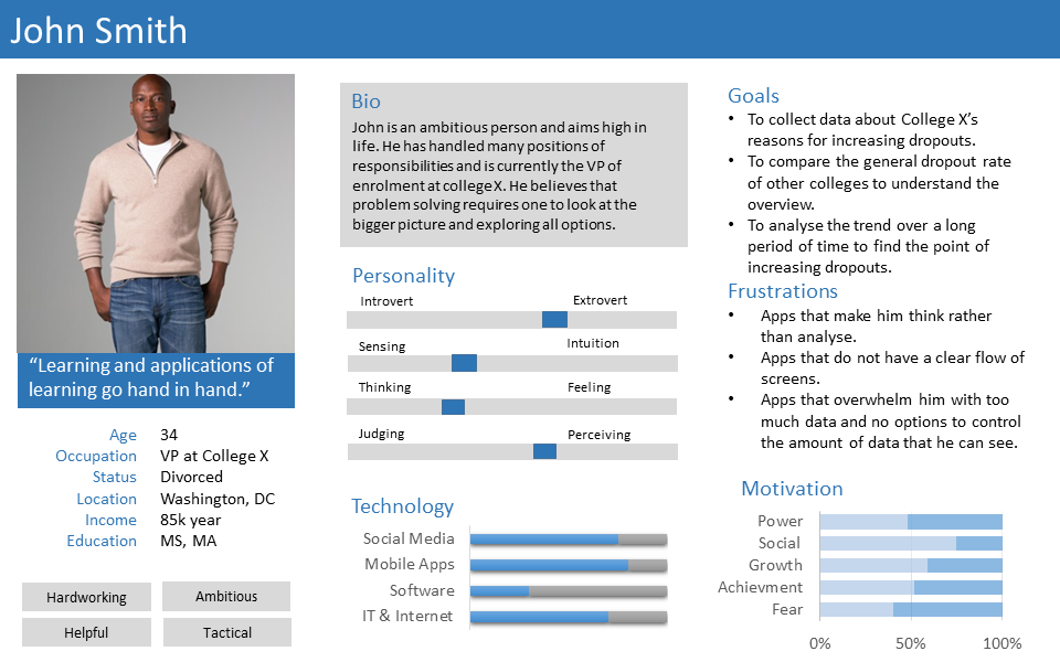
John is a analytic person who wants a dashboard on a mobile platform to compare and analyse data on the go. John hates being overwhelmed with too much data.
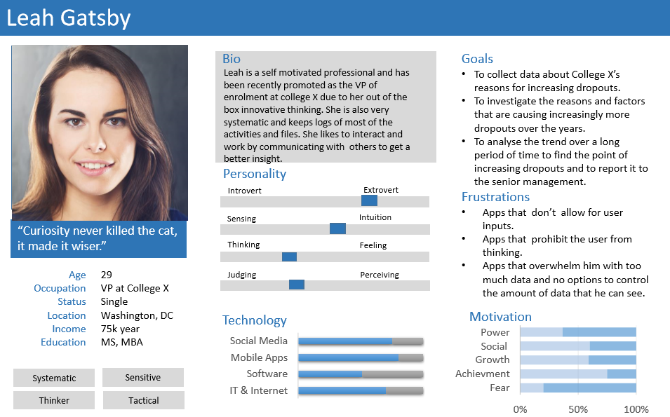
Leah is a thinker and wants a dashboard with options for customization. She also wants to be to control the information viewed and needs a minimalist solution.
Define Phase - Defining the problem
Created using thinking by analyzing user goals, business goals and environmentIn order to control the college dropout rate, how can we study the trends of the known causes over time and over different colleges?
In order to control the dropout rate, how can we uncover the remaining factors along with analysis of trends over time and over different colleges?
Design Phase - Creating Wireframes
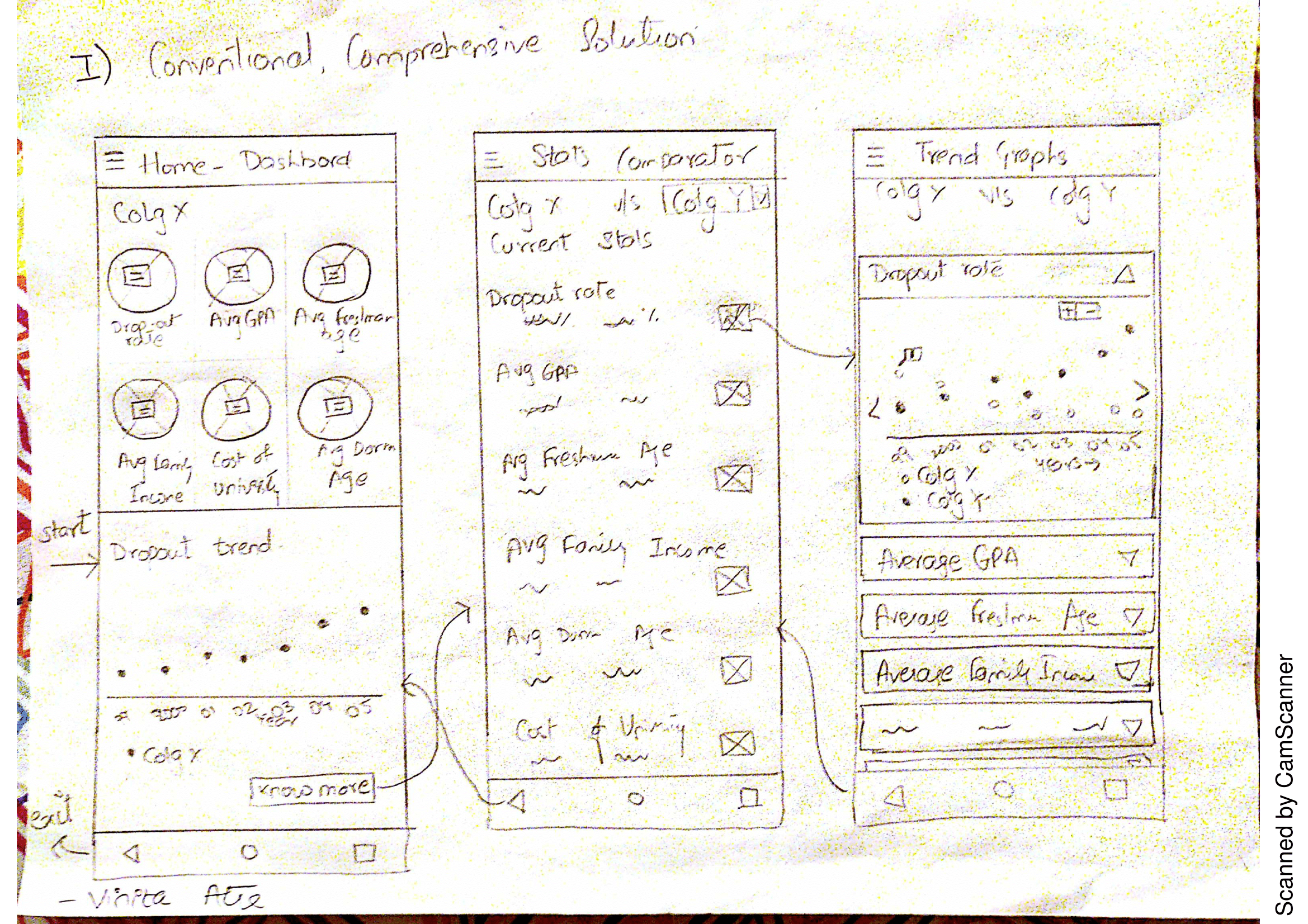
Created using Pen and paperData analyser Approach A conventional data analysis approach is taken to solve the problem of dropout faced by college X. Analysis is given emphasis over research. The design is minimalistic but conventional. The solution is comprehensive without being too overwhelming
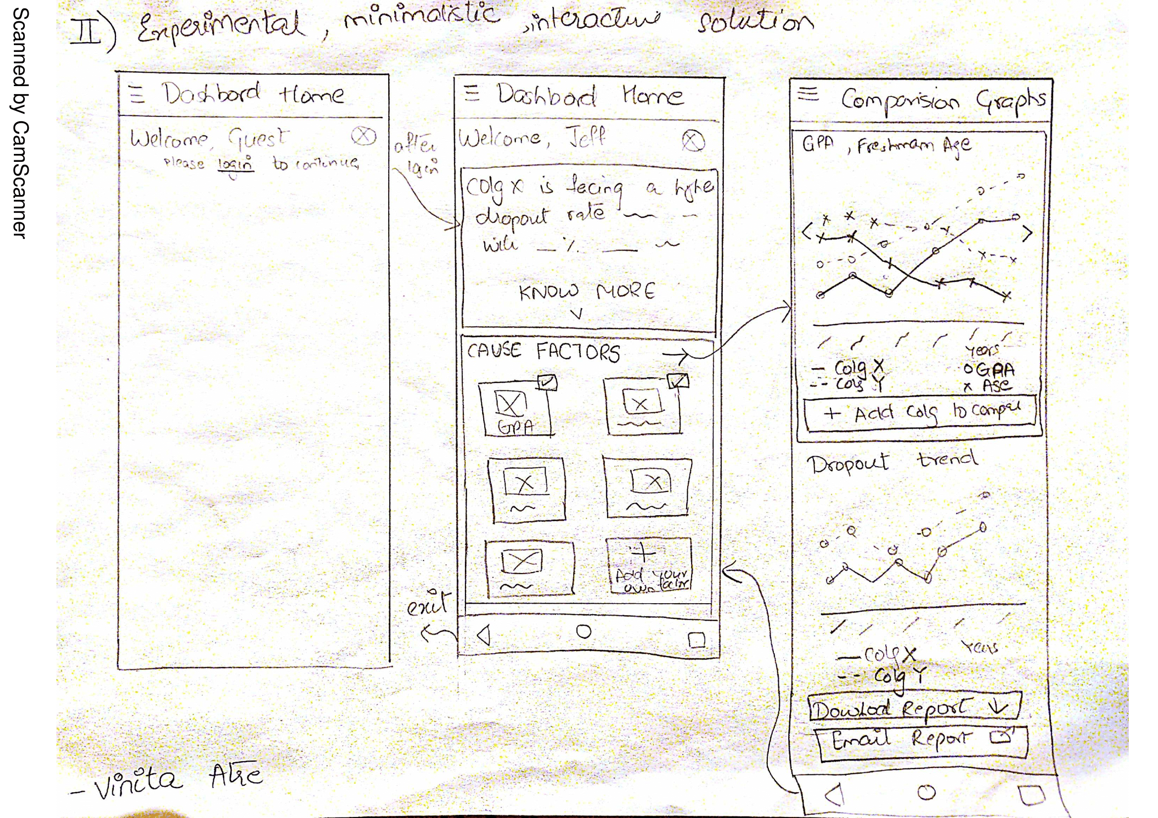
Data mining Approach A conventional data analysis approach is taken to solve the problem of dropout faced by college X. Analysis is given emphasis over research. The design is minimalist but conventional. The solution is comprehensive without being too overwhelming.
Design Phase - Creating Prototype
Created using Proto.ioI created two different working prototypes to represent the two solutions.
Information architecture considerations have led me to a 3 screen design with a home page, tabular stats comparison page, graphical stats comparison page.
The Home explains the problem by displaying the crucial factors for the college and the dropout trend. The Stats comparator page gives user the choice to compare the cause factors of College X with any other college for the current year in a tabular fashion. The Graph page provides a graphical comparison of trends for the cause factors over time.
Material colors are chosen with care to draw attention to certain UI elements or parts of the screen
The thinker-collaborative type dashboard consists of 3 screens which are Home page, Comparison Graphs page, and Generate Report Page. The Home explains the problem by displaying the crucial factors for the college and the dropout trend. It allows user input for probable causes. The Comparison Graphs page shows the data form the cause factors in graphs. The dropout trend over time is presented as an overlay at the bottom at all times. This allows easy comparing and as well as cause-effect analysis. To allow collaboration, the Generate Reports page provide a checklist of items to be added to the report along with section for comments which can then be sent to the right people by just using their names.
- Client: Coursework
- Date: October 2016
- Service: UX Design